Research that shaped the product, and took it to launch
Usability testing
Information architecture
Product strategy
Moderated usability testing of the app prototype with five UK active health-monitoring users, covering features, information architecture and product strategy, over two weeks of research and four weeks of design.
Virty set out to build a doctor-led, wearable-based family health service. Which features mattered most, how should the app be structured, and what would make people understand, trust and use it?
Testing the prototype, feature by feature
Moderated usability sessions on the prototype, the personal and family dashboards, care plans and health-metrics cards, testing comprehension, navigation and information architecture, and the perceived value of each feature. Five UK users aged 30 to 70, all active health-monitoring users.
What we found
Feature priorities: which dashboard and care-plan elements users valued, progress, the family view, health metrics, and which created confusion. Information architecture: how the dashboard, care plans and family data should be organised and labelled to match users' mental models. Product strategy: what builds trust and compliance in a doctor-led, whole-family health model.
The impact
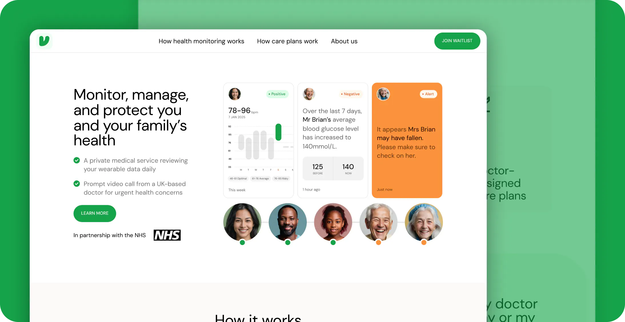
The research shaped Virty's features, information architecture and product strategy, and the product launched on the back of it at virty.health: a CQC-regulated service where UK doctors review a family's wearable data daily, with care plans, a family circle of care and NHS-record integration.




 Ecommerce